We could imagine the technologies of the platform on which I work, Build It, as a dish; where Ruby on Rails is our main dish but is accompanied by a good portion of JavaScript through Stimulus JS, and while this brings the functionality and that magical feeling of a single page application (SPA), there are things we want to keep simple instead of using a sledgehammer to kill an ant, as a university professor used to say. Therefore, we decided to take a page from Apple when handling dropdown menus or dropdowns and do it through pure CSS and HTML; without requiring a line of JavaScript.
The Pillars
Our two pillars in the view will be <input> elements of checkbox type and <label> tags. We will form our basic skeleton as follows:
<input id="toggle" type="checkbox"></input>
<label for="toggle"></label>
We will be using the checked property of checkbox-type inputs to control the content we show and when we show it. For this, we will be relying on the <label> element since by linking it through its for property it will also be affected by the class change when the checked property of our checkbox is present.
All our code will really be inside <label> in two sections: container and toggle as shown below.
<input id="toggle" type="checkbox"></input>
<label for="toggle">
  <div class="toggle">
    <!-- The element with which the user will interact -->
  </div>
  <div class="container">
    <!-- What we want to show-->
  </div>
</label>
The Magic
Now that we have our HTML skeleton ready, it’s time to add the CSS that will give our component the magical touch:
#toggle {
  display: none;
}

.container {
  display: none;
}

#toggle:checked + label .container {
  display: inherit;
}
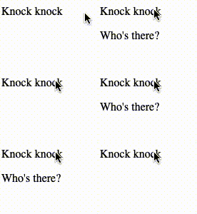
Our input with the toggle id will never be shown so that we do not have the checkbox present on our page, what we will show and with which the user interacts is what is inside our div with toggle class. Once they click on our toggle, the input will have the value of checked and with #toggle:checked+label we affect the style of our <label> to obtain a result like the following

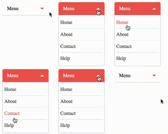
And with a little more style (courtesy of Thulio Philipe) we can have results like this

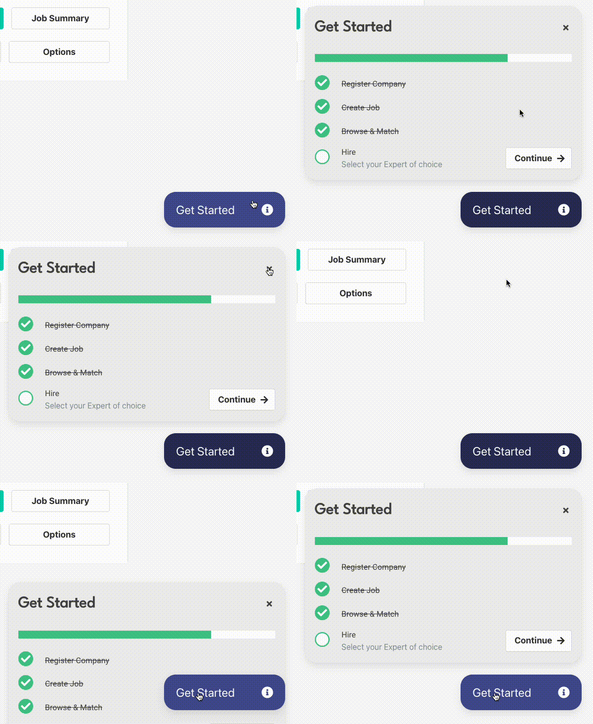
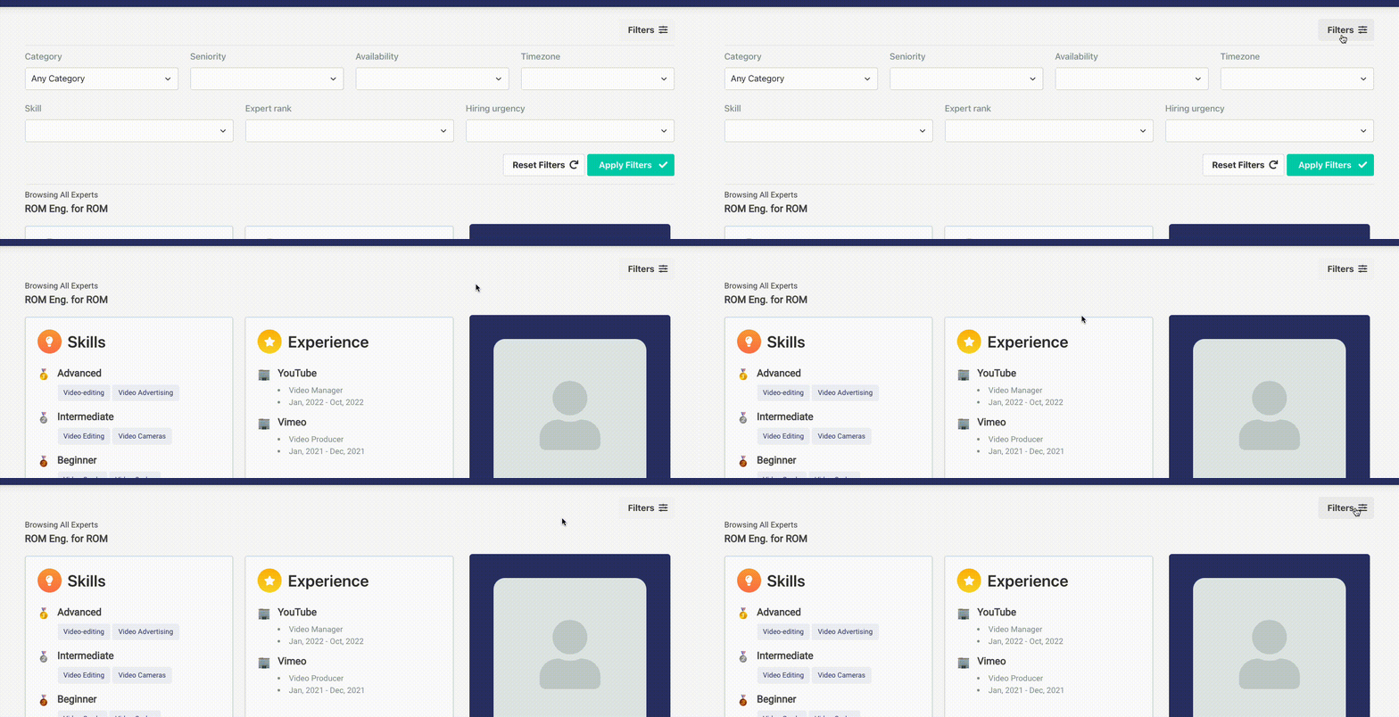
Or as the examples we have inside Build It

A small popover that is always present, giving vital information to the user

Or a filter menu that can be shown easily.
As we can see, modern CSS allows us to make interactive pages without the need for a script for it; giving us a new solution to a problem with endless ways to solve it, so it will be necessary to consider the needs of the project and what is most suitable.
Finally, I leave you a repository with a couple of examples seen in this article for future reference and I invite you to visit the platform and especially my profile, where we can connect for future projects.
「 Writings: Articles Tags: web development css 」